

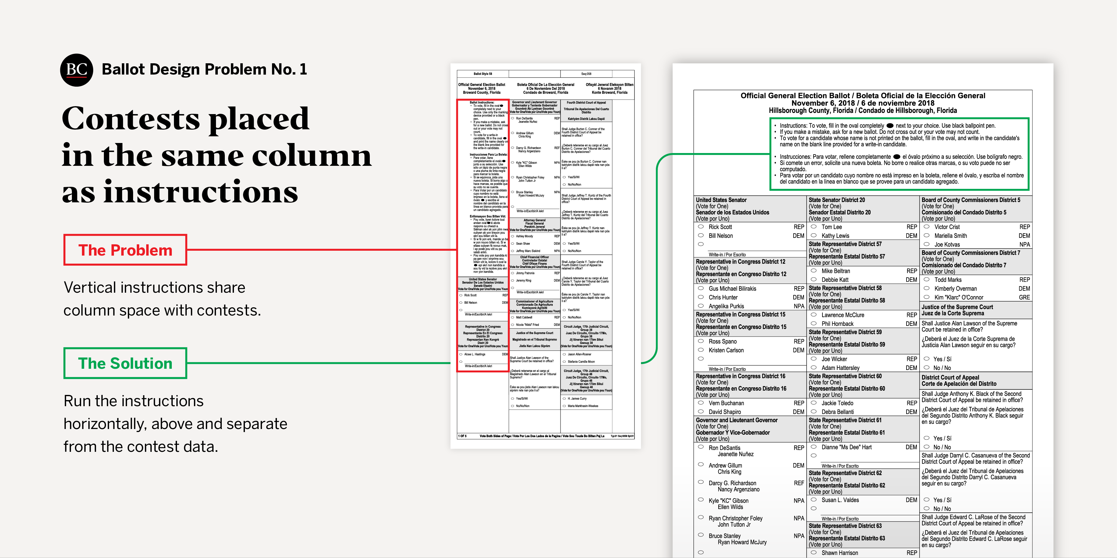
Problem No. 1: Contests placed in the same column as instructions
When instructions for voters are placed in a single ballot column and contests directly below them, voters are likely to overlook those contests. Such a design violates guidelines issued in 2007 by the U.S. Election Assistance Commission.
 Oxide Design Co.
The problem: Broward County, Florida, placed voter instructions in the left-hand column and contests directly below them. Since the instructions were in three languages, voters had to get through a considerable amount of text before arriving at the Senate contest beneath them. Voters may have never even looked at the bottom of the long ballot page — which might have hung off the edge of the booth — and instead begun with the governor contest in the second column. Other Florida ballots had shorter instructions and did a better job of seperating them from the contests.
The result: The placement of the contests in the same column as the instructions, combined with long, multiple-language instructions, proved consequantial. The difference between the undervote rate in the Senate contest and the governor’s contest was much higher in Broward Country than in other Florida counties. In Broward County, 3.5 percent fewer votes were cast for senator than for governor, while in other counties, the difference was negligible. This represents approximately 25,000 lost votes in the Senate contest, in which there was a margin of victory of approximately 10,000 votes.
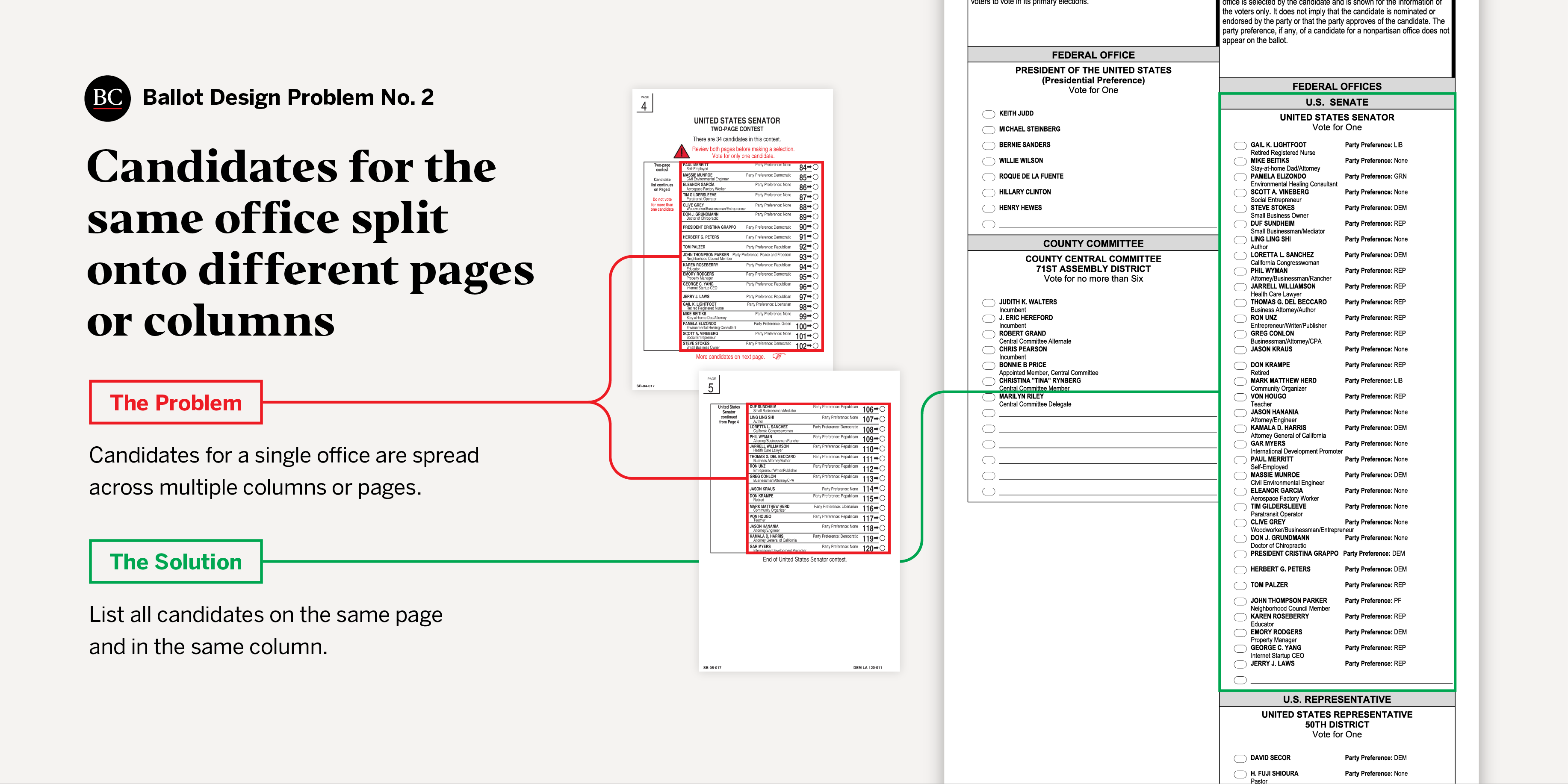
Problem No. 2: Candidates for the same office split onto different pages or columns
Splitting candidates for the same office onto different pages or columns tends to invite overvotes, in which voters make too many selections for a contest, usually accidentally (we illustrated the issue in our 2012 report Better Design, Better Elections). When all candidates for one office are listed in a single column, voters associate them as belonging to the same voting task. Conversely, when candidates for the same office are listed in multiple columns, voters have a harder time seeing the contest’s boundaries and might interpret the different columns as belonging to different voting tasks.
 Oxide Design Co.
The problem: In 2016, counties in California faced the challenge of fitting 34 candidates running in the U.S. Senate primary onto the ballot. Counties took different approaches to this design challenge: 33 of the state’s 58 counties listed the Senate candidates in more than one column and the rest fit the Senate candidates in a single column on one ballot page.
The result: According to an analysis by Professors David C. Kimball and Martha Kropf, the overvote rate was 3.6 percent in counties that listed the Senate candidates in multiple columns and 0.8 percent in counties that listed the Senate candidates in one column on a single page. Ballots with a multicolumn format accounted for close to 215,000 lost votes in the contest, according to a report by researchers Davit Avagyan and Philip Muller.
When counties anticipate this type of problem, they should conduct usability testing to determine the best route. Los Angeles County’s mechanical voting machines (retrofitted from punch cards) required two entire pages to fit the Senate candidates, so the county mitigated the issue by including a large red warning icon with instructions on the first page to vote for only one candidate, as well as design elements to help voters understand that the contest continued onto a second page. The solutions were designed with input from voters through a process of testing ideas, evaluating the results, and iterating the design. Although splitting the candidates still led to high residual vote rates, the situation could have been much worse if Los Angeles County and other counties in the state had not designed their ballots to minimize the problem or educated voters.
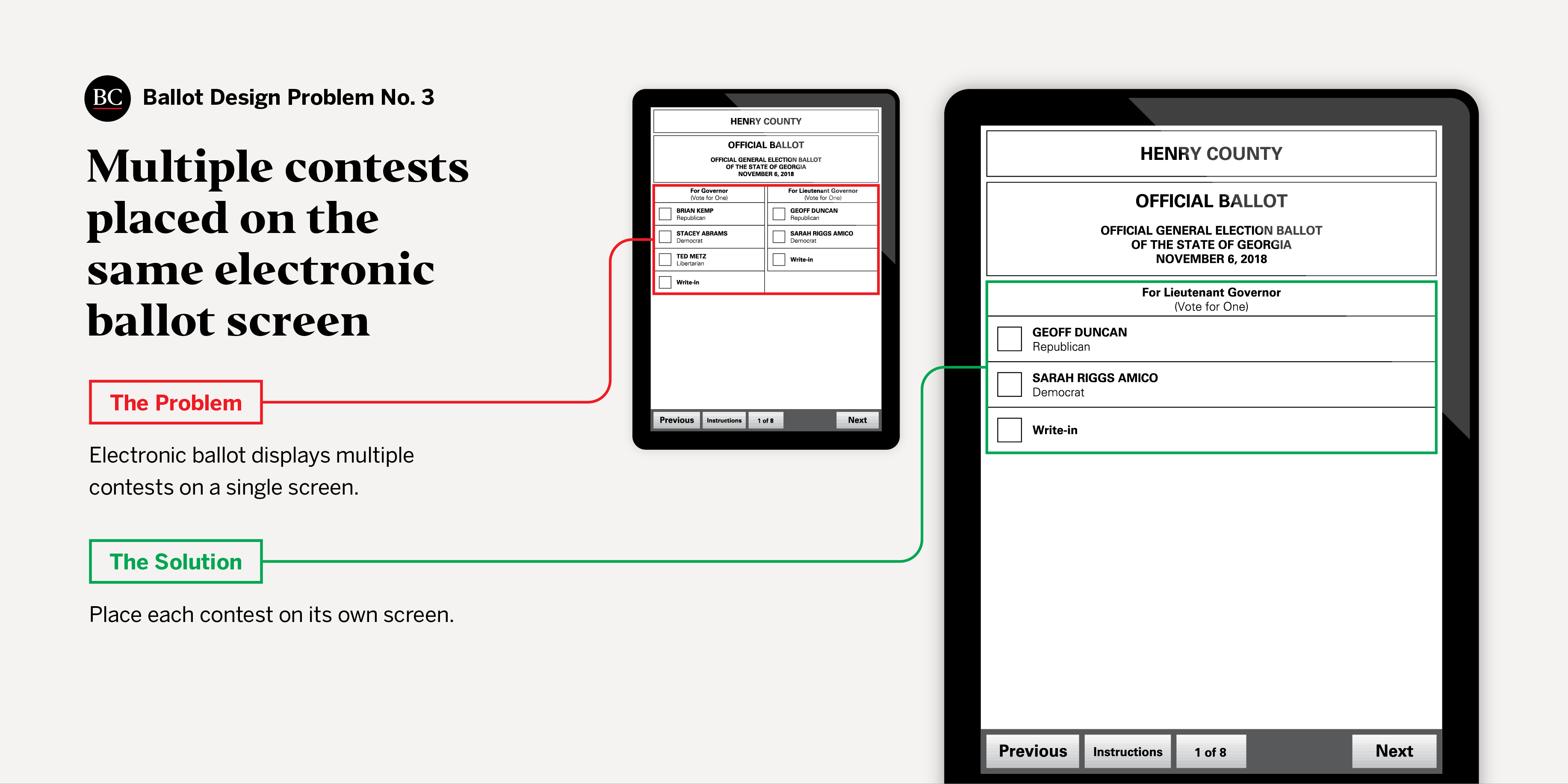
Problem No. 3: Multiple contests placed on the same electronic ballot screen
Just as with paper ballots it is best to display candidates for the same office on the same page or column, it is best when using electronic ballots to place candidates for just one contest on a single computer screen. This is a basic principle of interface usability; automated teller machines (ATMs), for example, generally ask one question at a time and proceed to a new screen only after the user has answered the previous question. People are far more likely to miss questions if they are asked to answer more than one at a time.
 Oxide Design Co.
The problem: In the 2018 midterm election, at least some of Georgia’s electronic ballots contained multiple contests on a single screen. The electronic interface in some counties displayed candidates for the lieutenant governor contest on the same screen as candidates for other contests.
The result: Four percent fewer votes were cast for lieutenant governor than for governor, and 2.7 percent fewer votes for lieutenant governor than for secretary of state. That represents 103,290 to 159,024 lost votes for lieutenant governor in a contest where the margin of victory was 123,172 votes. Since Georgia’s voting systems in 2018 did not have a paper backup, it is difficult to know with certainty the cause of the high undervote rate, but history suggests that the placement of two contests on one screen could have played a major role.
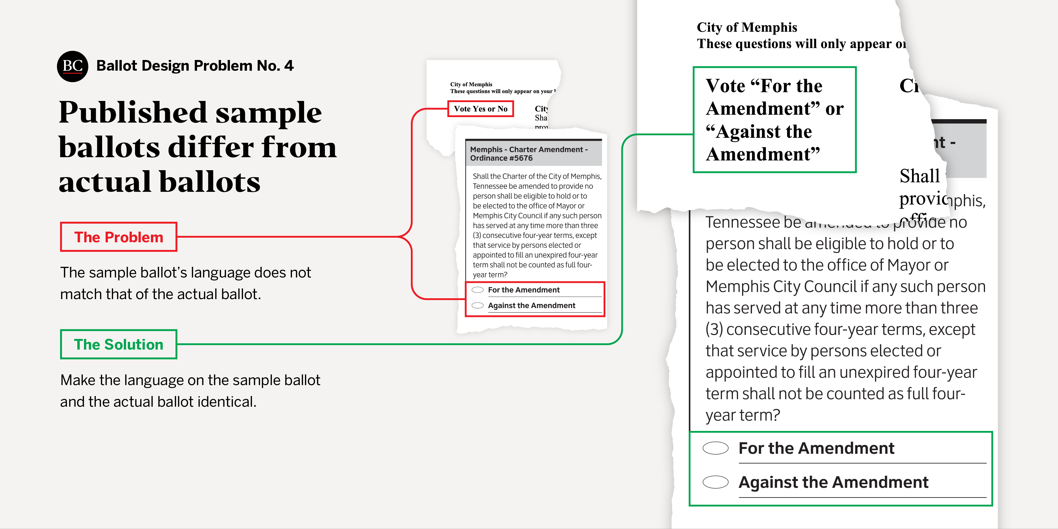
Problem No. 4: Published sample ballots differ from actual ballots
Sample ballots allow voters to familiarize themselves with the layout of contests and candidates, the different voting tasks, and the ballot language. As such, they should look like the ballots that voters will use on Election Day.
 Oxide Design Co.
The problem: In the 2018 general election, ballots in the city of Memphis, Tennessee, were different than the sample ballots Shelby County published for the city prior to early voting. Whereas the ballot questions had “yes” or “no” response options on the sample, they had “for” and “against” response options on the actual ballot. The sample also failed to mimic the layout of the electronic ballot and therefore did not provide voters with an approximation of what they would encounter in the polling place. Instead, the sample ballot only listed the contests and candidates.
The result: During early voting, voters encountered ballots that were different than the sample they might have reviewed ahead of time. The discrepancy in language, a local voting reform group argued, compounded the issue of already misleading and confusing ballot questions. According to Elena Delavega, a professor at the University of Memphis, “material meant for the general public should be written at 900 Lexile, or the equivalent of a fourth-grade reading level,” yet the ballot questions were written at 2,000 Lexile.
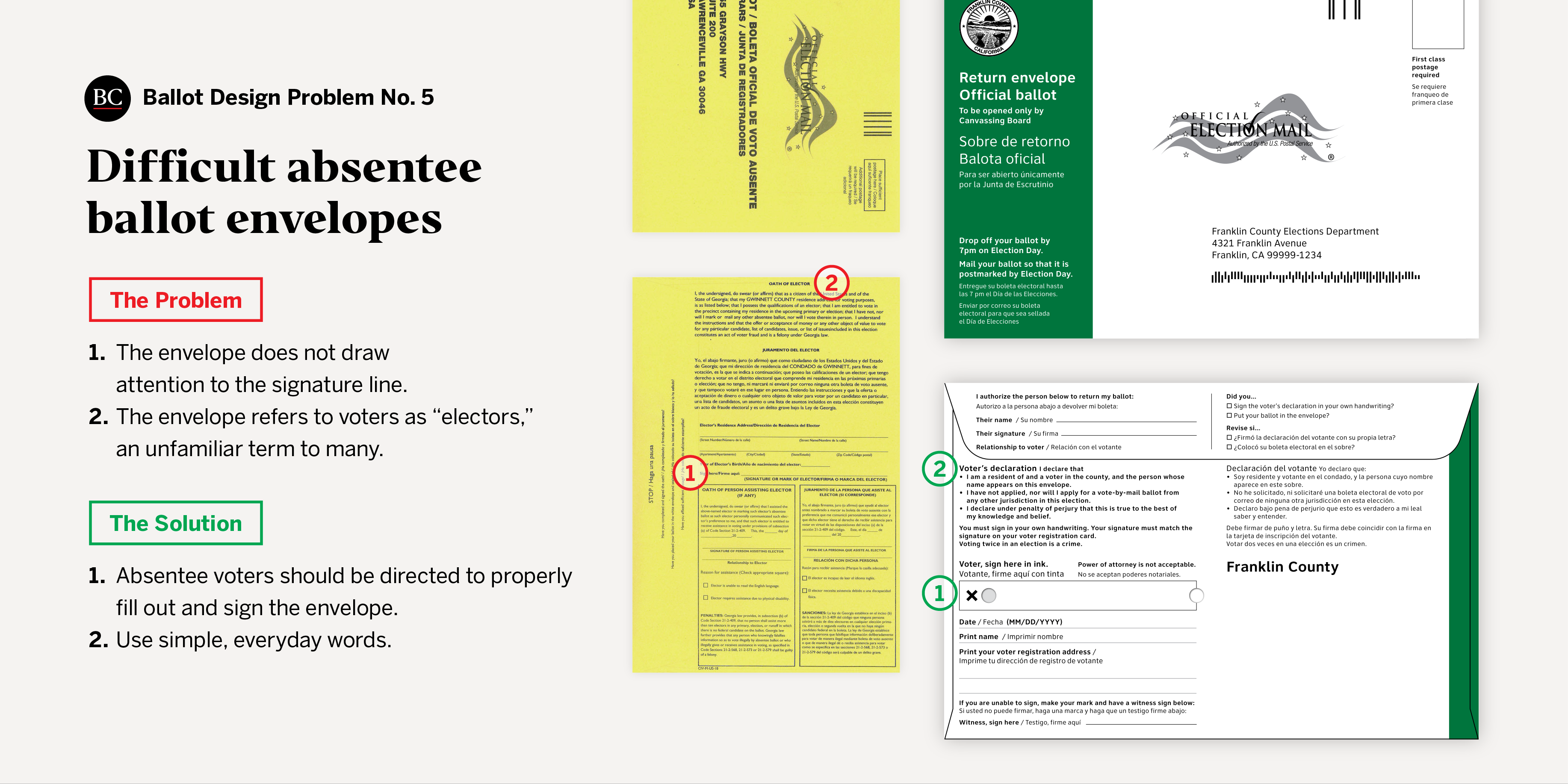
Problem No. 5: Difficult absentee ballot envelopes
The use of vote-at-home ballots (ballots submitted by mail or at a drop-off location, often before an election) has been steadily increasing for the past couple of decades. The proportion of such ballots has nearly doubled, from 13 percent of votes cast nationwide in 2004 to 23 percent in 2018. But they are likely to go uncounted if voters fail to properly fill out and sign the envelope containing them. Of the returned-by-mail ballots in the 2018 election, 91.8 percent were counted, 1.4 percent were rejected, and 6.8 percent were not categorized as either counted or rejected, according to the 2018 Election Administration and Voting Survey.
 Oxide Design Co.
The problem: In the 2018 midterm election, design flaws made the absentee ballot envelope in Gwinnett County, Georgia, confusing to voters. First, there was no X or box to draw voters’ attention to the signature line. The instructions below the signature line read “signature or mark of elector,” but voters rarely think of themselves as “electors.” Finally, the envelope’s language format was inconsistent: the English and Spanish voter oaths were placed on top of each, but the English and Spanish oaths for the “person assisting elector” were placed side by side.
The result: In the weeks leading up to the 2018 general election, reports surfaced about the alarming rate at which Gwinnett County was rejecting mail-in ballots. Our analysis revealed that the county rejected a total of 1,690 mail-in ballots ― 21 percent of those rejected in Georgia during that election ― even though Gwinnett County accounted for only 10 percent of the mail-in ballots submitted in the state. Among the issues that led to the rejections were missing birth dates, address discrepancies, and signatures that were missing or did not match those on registration records.
Absentee ballot envelope design flaws have been addressed elsewhere. An increasing number of states notify voters of problems and allow voters to fix (or “cure”) them. In 2014, a change in Florida election law allowed voters to cure envelopes by completing an affidavit.
This new law prompted Escambia County, Florida, to review and redesign its absentee ballot envelope. An envelope introduced for the 2016 primary includes a checklist on the outside, instructions with simple illustrations, good line spacing, larger text, bullets to make the voter’s oath easier to read, and color to highlight the signature area. Compared to the 2012 presidential election, the 2016 presidential election saw an 18 percent drop in absentee ballots missing a signature and a 70 percent drop in rejections overall after missing signatures were cured.