


Now that the 2020 census data has been officially released, states will soon unveil new congressional and legislative maps. In many states, a lack of meaningful safeguards and single-party control of the process once again threaten to produce districts shaped by gerrymandering, which carves up communities based only on the partisan inclinations of each household.
The public has an important role to play in pushing back against the practice, but it’s important to understand that recognizing unfair maps means considering more than just the shapes of their districts.
It would certainly seem reasonable to be suspicious of oddly shaped districts — after all, the word “gerrymander” was inspired by a Massachusetts district that looked like a salamander created when Founding Father Elbridge Gerry was governor. But sometimes boundaries that look odd at first glance just follow a natural geographic feature, like a river or a mountain range. Or they could be necessary to unite communities that live in different areas but share similar representational needs, like communities of color that have been subject to residential discrimination. Other times, odd boundaries are very much the product of gerrymandering.
But just because a district has neat and regular looking district lines doesn’t mean it isn’t a gerrymander. In fact, some of the most aggressively gerrymandered maps don’t have any odd-looking districts at all.
The reality is that visual inspection can be a helpful, but ultimately very incomplete, analysis. It is a good first test that can help identify where a deeper dive is needed. In other words, don’t judge a book by its cover.
The following examples demonstrate why a district’s shape doesn’t tell the whole story.
Illinois’s Fourth Congressional District
Illinois’s Fourth Congressional District (IL-04) is often called out for its unusual shape, which extends across the northwest and southwest sides of Chicago. However, it unites two Latino communities that share broadly similar socio-economic conditions and common characteristics in terms of their language, culture, and representational needs. The legacy of residential segregation policies, which split apart communities of color and pushed them to the outskirts of cities, continues to affect how Latino groups are distributed in Chicago.

Combining these communities within one district enables them to elect candidates who prioritize their interests. After it was first drawn during the 1990 redistricting cycle, constituents in IL-04 became the first in the Midwest to send a Latino representative to Congress.
Separating the district’s two Latino communities to create a neater-looking map could weaken their voting power and possibly violate the Voting Rights Act of 1965. A closer look reveals that this district’s odd shape helps protect a community of interest, a key goal of fair redistricting.
Pennsylvania’s Seventh Congressional District
Pennsylvania’s Seventh Congressional District (PA-07) is an example of how oddly shaped districts can sometimes be gerrymanders.
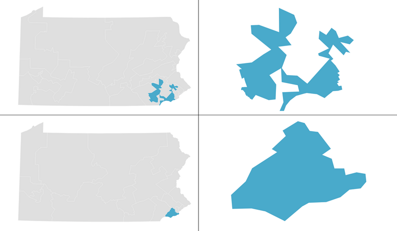
As drawn by Republican lawmakers in 2011, it stretched across 50 miles of Philadelphia suburbs and Amish farmland without following natural geographic boundaries or community lines, in some places narrowing to the width of a single parking lot or building. Community members struggled to join together to influence elected leaders because they couldn’t tell which of their neighbors lived in the district. Republicans drew this district with the specific goal of excluding left-leaning areas that would dilute their right-wing base.
However, in 2018, the Pennsylvania Supreme Court ruled that the state’s congressional map was an excessive partisan gerrymander that favored Republicans. The court then adopted a replacement congressional map that has produced more competitive elections and fairer outcomes.
Most of the old PA-07 ended up in the new Fifth Congressional District, which follows existing political boundaries and contains a unified community of the Philadelphia suburbs. The strange shape of districts like PA-07 invited questions about the original map, and further analysis showed that it was drawn for unfair partisan reasons.
North Carolina’s Thirteenth and Sixth Congressional Districts
North Carolina’s congressional maps from the last decade demonstrate how unremarkable district shapes can conceal attempts at partisan gerrymandering. The Greensboro area around North Carolina A&T State University, the nation’s largest historically Black university, is a clear example.
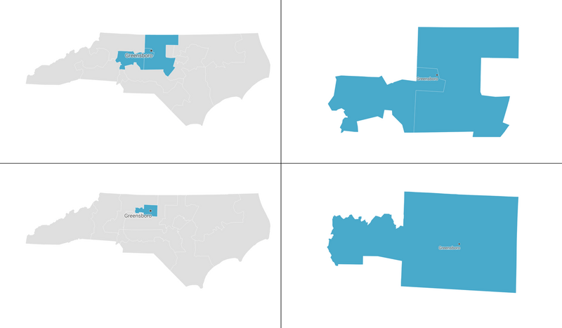
During the 2010 redistricting cycle, Republican lawmakers drew a map that concentrated A&T students and Black voters in the surrounding areas into the Twelfth Congressional District, reducing their statewide political influence through “packing.”
When a court struck down this district as a racial gerrymander in 2016, lawmakers redrew the map to divide A&T’s campus across the Thirteenth and Sixth Congressional Districts (NC-13 and NC-06), weakening students’ voting power through “cracking.” By refusing to recognize the school’s campus as a community of interest, North Carolina lawmakers were able to draw two relatively compact districts that would be comfortably won by Republicans.
When a state court ruled this map was also a partisan gerrymander in 2019, it was redrawn to place A&T’s full campus within NC-06. Many students at the university said they were motivated to participate politically after learning how their community had been targeted by partisan gerrymandering. The seat shifted from Republican to Democratic control in the redrawn map, suggesting that students and community members were deprived of adequate political representation when divided across two districts.
The university community’s experience over the past decade highlights the importance of looking beyond visual appearance to determine whether a map has been drawn fairly, because regular-seeming shapes can be deceiving.
California’s Forty-Fifth Congressional District
California’s Forty-Fifth Congressional District (CA-45) was drawn by an independent redistricting commission instead of a state legislature. The commission gained control of the redistricting process starting with the 2010 cycle, when it drew districts including CA-45.

Following instructions to keep communities of interest together, the California commission drew CA-45 with a fairly regular shape. Bounded by major highways, it encompasses parts of communities in central and southern Orange County. Although the region was once a conservative stronghold, Latino and Asian communities have been driving recent population growth in recent years, resulting in shifts in residents’ political preferences. Whereas the prior legislatively drawn map ruthlessly divided communities to protect incumbents and prevent seats from changing hands, in 2018 CA-45 was among four seats in Orange County that flipped from Republican to Democratic control.
This marked the first time that CA-45 had sent a Democrat to Congress. The 2020 election then saw two Orange County districts switch back to Republicans, although CA-45 reelected its Democratic incumbent. Creating more competition was not a goal of the redistricting commission, but by keeping communities together, the map ensures that as the political leanings of a state’s population shift, residents will elect leaders in line with those changes.
This district is, in short, an example of a neatly shaped district that does represent people well.
A district’s shape is just one factor to consider when judging the representational effects of a proposed map. Strangely shaped districts are not necessarily a problem if they enable everyone to meaningfully participate in our democracy. As the redistricting cycle picks up steam, public comments on proposed maps must look beyond visual appearance to assess whether the plans promote fair representation for communities.

