


Last March, the Brennan Center published a study that projected that maps in states like California and New York would be far more responsive to voter preferences than gerrymandered maps in states like North Carolina. That proved to be the case in this month’s election. But the study also built a model to gauge the effect of gerrymandering at the national level, and projected that Democrats would need to win the national popular vote by 10.6 points in order to be favored to win a majority of U.S. House seats. While we cautioned at the time that 2018 could be an unusual year — and was it ever — that part of the study was a miss.
Votes are still being counted in a handful of races, but here’s our preliminary assessment of what our model got right and what it didn’t.
Let’s start with the most obvious thing. Democrats look on track to win around 40 seats once counting is done, giving them a 17-seat majority. And they look likely to do so while winning the national vote by 8 or so points, less than the 10.6 points we projected. Looking back, we were too complacent about the degree to which the 2018 election would look like the 2012, 2014, and 2016 contests. And we should have paid more attention to signs, including Democrat Conor Lamb’s surprise special election victory in Pennsylvania in February, that 2018 would be an unusual and anomalous year.
We made our prediction using a uniform vote swing analysis. That’s an accepted method in political science to gauge the responsiveness of maps — the paper that first proposed the method in 1987 has been cited more than 200 times. But in 2018, four factors in particular seem to have impacted its effectiveness as a predictive tool at the national level, especially in districts drawn by commissions and courts and, to a lesser degree, in districts drawn under single-party control:
Turnout: 2018 saw the highest midterm turnout since 1914 (in a few states exceeding 2016 presidential levels). Historically, higher turnout favors challengers, and early modeling of the 2018 electorate suggests that the midterm surge included a high percentage of new and irregular Democratic-leaning voters.
Retirements: The 2018 cycle also saw 39 Republican retirements, the highest number since 2008, reducing the advantage Republicans received from incumbency. Nine of the districts that Democrats won where the model projected a loss were open seats.
Record Fundraising: Democratic candidates across the board also enjoyed record fundraising, fueled in part by small-dollar donations, enabling Democrats to compete in unexpected seats. In the seats where our model projected a Republican win but Democrats actually won, Democratic candidates enjoyed a whopping 3.6 to 1 advantage in fundraising in districts without an incumbent and a nearly 2 to 1 advantage in districts with an incumbent.
Electorate Shifts: Democratic candidates in some parts of the country also received unexpectedly strong support from some subgroups of traditionally Republican voters, most notably white college-educated women, who, by early calculations, increased their support for Democrats by almost eight points over 2016. It is too early yet to know whether this shift toward Democrats is a wave-year blip or the harbinger of a rare political realignment in American politics. But in 2018 at least, those shifts were enough to upset the political calculus underlying many maps — though not, as noted below, in aggressively gerrymandered states like North Carolina.
All of these factors combined to make 2018 an especially volatile year.
That volatility played out with particular force in districts drawn by commissions or courts, which account for at least 7 in 10 of the seats gained by Democrats, and a similar share of seats where our model incorrectly predicted a Republican win. Maps drawn by courts proved especially responsive to voter preferences, with maps in Florida, Pennsylvania, Minnesota, and Virginia accounting for 11 of the 40 seats that flipped this year. That may be due to the fact that both commission- and court-drawn maps do far better at keeping communities together, allowing shifts in sentiment among similar groups of voters — for example, white suburban women — to be better manifested in electoral outcomes. (Court-drawn maps also gave Republicans their only three pickups of the cycle.)
But the volatility of 2018 also appears to have helped flip districts like Oklahoma’s 5th or South Carolina’s 1st, which were drawn by Republican-controlled governments.
At the end of the day, the uniform vote swing analysis was too blunt an instrument at the national level. The analysis is built on two assumptions: First, that the present will be broadly similar to the past, and second, that any shifts will be uniform across the country — driven by things such as economic conditions and presidential approval ratings. In contrast to normal years, both those assumptions were off in 2018. Not only was 2018 different in meaningful ways (as explained above), but the effects were uneven, leading some commentators to describe the midterm as less of a wave than a series of “regional cyclones.” Notably, while Democrats in districts won by a Republican improved Democratic performance by an average of 3.3 percentage points over 2016, the average Democratic candidate in a district that flipped to the Democrats improved Democratic performance by an average of 9.4 percentage points. The latter were disproportionately districts drawn by commissions and courts.
Of course, other models came closer to accurately predicting the share of votes that Democrats would need to take the House. That’s in part because they considered some of the factors like retirements and fundraising that made 2018 unusual.
However, if the model did not work perfectly in 2018 to gauge the national impact of gerrymandering, our assessments of the probable outcomes in the worst gerrymandered states were spot on.
As it turned out, the extreme partisan gerrymanders in Ohio, North Carolina, and Michigan held up remarkably well. In the first two states, Democrats won around half the vote but failed to win even a single additional House district, being held to just 3 of 13 seats in North Carolina and 4 of 16 seats in Ohio. We predicted as much. In North Carolina, the packing of Democratic voters into three districts and the careful combination of suburban and rural areas into other districts meant that both turnout surges and shifts in support from suburban voters were effectively minimized. A similar dynamic seems to have played out in Ohio.
Only in Michigan did two Republican districts anchored in the Detroit suburbs flip to Democrats, fueled, it appears, by double-digit shifts toward Democrats in affluent Oakland County. Another two districts in racially gerrymandered Texas also unexpectedly flipped to Democrats — likely a combination of an increase in the number of non-white voters in the Texas suburbs and the same shifts among suburban white voters seen elsewhere in the nation.
At the end of the day, how did the model do?
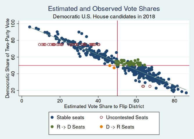
Overall, it performed relatively well. In total, we classified 393 of the House districts correctly (90.3%) using election data from 2012, 2014, and 2016. The figure below shows the relationship between the Democratic share of the two-party vote and our expected vote share needed to flip the district. We also identify the uncontested races this cycle — 39 races without a Republican running and 3 without a Democrat running. The districts our model did not categorize correctly are highlighted in green or yellow. These districts are all fairly close to the 50–50 reference lines and the linear best fit line. In total, the correlation between these two quantities is –0.95, an indication the two variables are highly related to each other.
But clearly we, like the Republican map drawers in states like Oklahoma and South Carolina, weren’t anticipating everything that would happen in 2018. And given the signs that were already starting to pile up early in 2018 about an unusual year, we should have been clearer in acknowledging the uncertainties.
Maps drawn by commissions and courts, in particular, proved especially susceptible to changing hands. Why that was the case is an important subject for study that may teach us a lot about how and why commission maps are more responsive and fairer than maps drawn by partisan lawmakers. Any future national model will need to be calibrated to better take account of those lessons. The absolute difference between the expected vote share and the actual vote share in the flipped, court-drawn districts is about 4 points; in commission-drawn, flipped districts it is about 5.5 points. These quantities give us an idea of a deflationary factor that might be called for in future estimates that try to predict congressional elections by accounting for redistricting institutions.
And, while some pundits are starting to say that gerrymandering doesn’t matter, quite the opposite is true. Indeed, 2018 is a powerful cautionary tale. While Republicans lost unexpected seats in Oklahoma and South Carolina, GOP mapdrawers in North Carolina and Ohio were more careful to build tsunami defenses into their maps. As a result, their maps held against the storm of a century. 2018 proves that gerrymandering can and does work, notwithstanding wave years or even the occasional rare political realignment. In fact, it could provide lessons for future gerrymanderers: Just as New York City and New Orleans built new storm protections after being flooded in actual hurricanes, so the partisan map drawers of tomorrow will be able to use the political superstorm of 2018 to set the new high water mark that future gerrymandered maps will have to survive.
(Image: BCJ/Getty/Shutterstock)